7 Tips for Creatives: How to Craft a Killer Data Sheet
Apr 23, 2025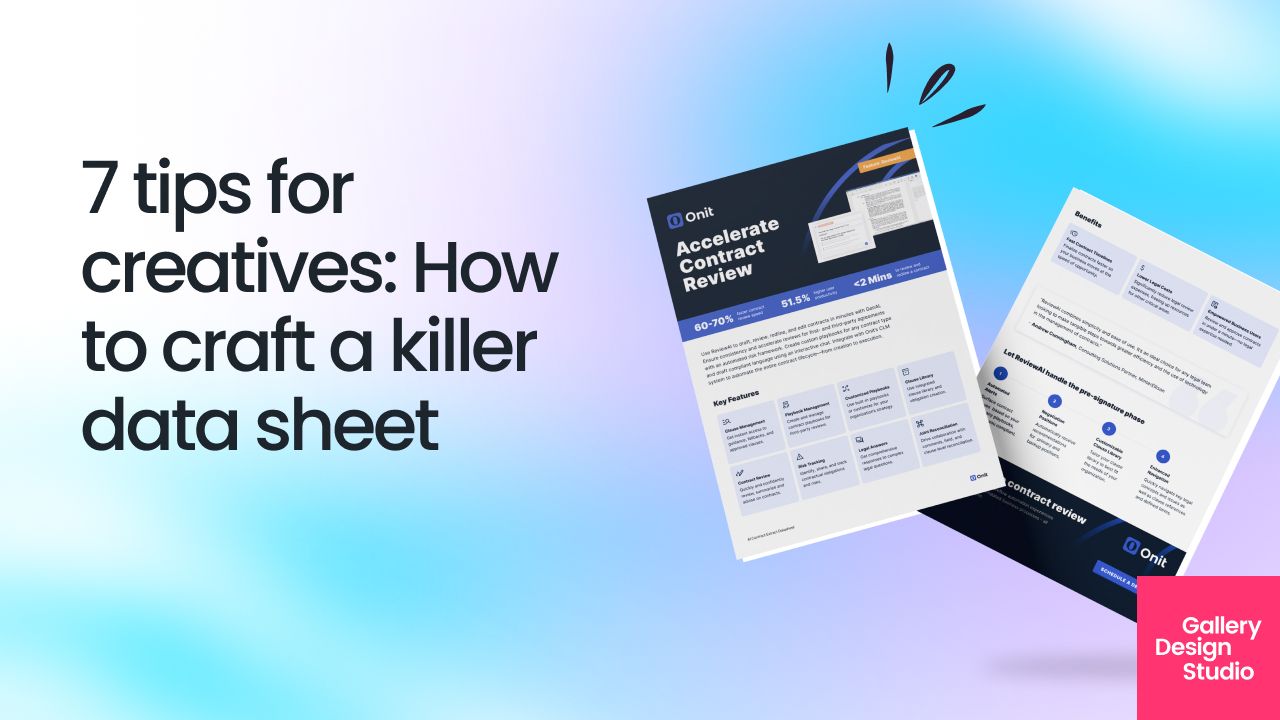
A data sheet is one of the most underrated, yet powerful assets in B2B enterprise tech marketing. It’s the go-to document for buyers who need to quickly understand your product or service, evaluate how it fits their needs, and make a confident purchasing decision.
But let’s be real—most data sheets are boring, cluttered, and uninspiring.
If you want to create a killer data sheet that doesn’t just inform but converts, here’s how to do it—with real-world examples from leading B2B tech companies
1. Start With a Clear, Punchy Headline
Your headline should instantly communicate what your product does and why it matters. Avoid generic titles like “Product Overview.” Instead, get specific.
✅ Example: “Snowflake: The Data Cloud for Modern Enterprises”
Why it works: It clearly states the brand, its core value (data cloud), and the target audience (modern enterprises).
💡 Tip: Use action-driven language that highlights your competitive edge.
2. Nail the Summary in 2-3 Sentences
Your audience has zero patience for fluff.
In 2-3 sentences, explain:
- What your product/service does
- Who it’s for
- The core benefits
✅ Example: HubSpot CRM
“HubSpot’s CRM helps sales teams track leads, automate outreach, and close deals faster—all in one user-friendly platform.”
💡 Tip: Write this as if you were explaining your product to a busy executive who only has 30 seconds to decide if they care
Here's a good example from Crowdstrike.
3. Make Features & Benefits Instantly Scannable
Your features list should be digestible at a glance. Use bullet points and keep each point concise.
Bad Example:
“Our AI-powered analytics dashboard offers robust customization, workflow automation, and third-party integration capabilities to enhance operational efficiency.”
Better Example:
✅ AI-Powered Analytics – Get instant insights without manual number crunching
✅ Workflow Automation – Automate repetitive tasks to save time
✅ Seamless Integrations – Connect with 100+ tools, including Salesforce & Slack
💡 Tip: Don’t just list features—tie them to a real benefit your audience cares about.
IBM's datasheet highlights their benefits clearly.
4. Use Visuals to Simplify Complex Ideas
B2B buyers love data, but they don’t love walls of text. Use diagrams, charts, and infographics to communicate value faster.
✅ Example: Datadog’s Monitoring Dashboard
Instead of listing every feature, Datadog includes a screenshot of its real-time monitoring dashboard, so users instantly see what they’re getting.
💡 Tip: If your product is software, show an annotated screenshot of the UI. If it’s a service, include a simple process diagram.
5. Show Real-World Impact (Not Just Features)
Your data sheet needs proof that your product works. This can be in the form of:
- Customer testimonials
- Case study snippets (before/after impact)
- Performance metrics
✅ Example: CrowdStrike
Instead of just listing security features, CrowdStrike highlights:
“99% breach prevention rate | 75% reduction in investigation time | $1M saved in security costs per year.”
💡 Tip: If you don’t have hard data yet, use a customer quote about how your product improved their workflow.
6. Keep the Design Clean & Brand-Aligned
Your data sheet should look as premium as your brand. Some quick design rules:
- Stick to your brand colors and fonts
- Use white space to avoid clutter
- Keep sections well-organized with clear headers
✅ Example: AWS Solution Briefs
AWS uses a clean two-column layout, with key features on the left and a supporting visual on the right—making it easy to scan.
💡 Tip: If your data sheet looks like a PowerPoint slide from 1999, it’s time for a redesign
7. End With a Strong Call-to-Action (CTA)
Your data sheet isn’t just for informing buyers—it’s for converting them. End with a clear next step, like:
✅ “Book a Demo” – Ideal for SaaS and tech platforms
✅ “Download the Full Report” – If you offer an in-depth resource
✅ “Talk to an Expert” – For complex solutions that require consultation
✅ Example: Monday.com
“See how Monday.com can streamline your workflows—get a free 14-day trial today.”
💡 Tip: Don’t assume readers know what to do next—spell it out.
Final Thoughts: A Killer Data Sheet Sells for You
A killer data sheet isn’t just a technical document—it’s a sales tool. When done right, it becomes a mini-pitch that works 24/7, giving buyers the confidence they need to take the next step.
If your current data sheets feel clunky, uninspired, or unclear, it’s time for a refresh.
About Gallery Design Studio (GDS)
Content takes many forms—we make it visual first.
For over a decade, high-growth B2B tech brands have trusted us to distill complex solutions into clear, engaging visuals that their audience can instantly “get.”
Whether software, systems, or solutions, we help you communicate with clarity and impact—so you can focus on what’s next.
Learn more here.


