Fun Design Facts to Brighten Your Day
Jul 16, 2025
We like to talk about heavy-hitting B2B content ideas here, but sometimes we just need to take a break and dish out random design facts, just for fun.
Enjoy!
Design Facts
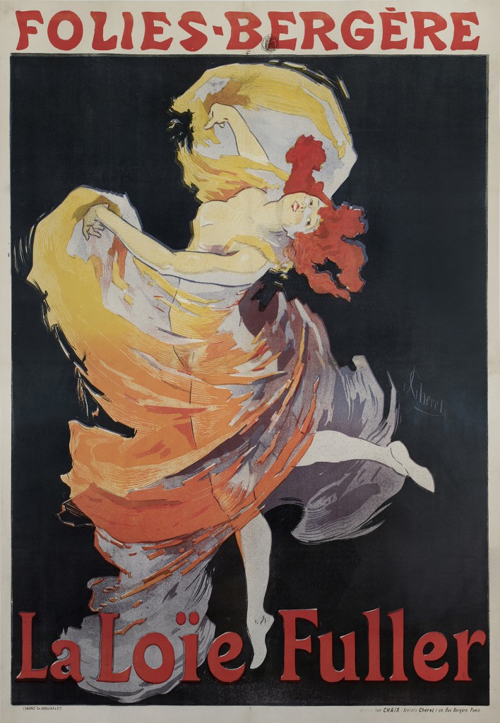
- The modern poster was born in the late 19th century with the advent of lithography, which allowed for mass production. French artist Jules Chéret is often credited as the father of the modern poster due to his vibrant and artistic designs.
- Saul Bass revolutionized film posters and title sequences with his minimalist and symbolic designs. Notable works include the posters and titles for "The Man with the Golden Arm," "Vertigo," and "Psycho."
- Infographics, now a staple in data visualization, have roots dating back to the early 20th century. Otto Neurath, an Austrian philosopher, developed Isotype (International System of Typographic Picture Education) in the 1920s to help communicate complex information through simple, visual means.
- From 2004 to 2014, design-led firms delivered returns 219% above those of the Standard & Poor’s 500 index.
- Studies have found that consistent branding through logos and other visual elements can increase revenue by up to 23%.
- 90% of people are more likely to remember information when presented with a visual aid, making logos crucial for brand recall.
- Many famous works of art and architecture, such as the Parthenon and Leonardo da Vinci's "Vitruvian Man," utilize the golden ratio (approximately 1.618:1) to achieve aesthetically pleasing proportions.

Logo Facts
- Blue is the most popular logo color among the world’s top brands. It conveys trust, reliability, and professionalism.
- Some of the oldest known logos belong to family crests and coats of arms used by nobility in medieval Europe. These symbols served as early forms of brand identity, signifying lineage, property, and social status.
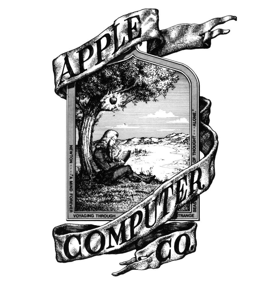
- The original Apple logo, designed in 1976, depicted Isaac Newton under an apple tree. It was replaced a year later by the rainbow-striped apple silhouette designed by Rob Janoff, which has since evolved into a sleek, monochrome logo.
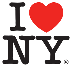
- The "I ♥ NY" logo, designed by Milton Glaser in 1977, was created for a state marketing campaign and has become one of the most recognized symbols in the world. Glaser designed it for free as a part of a pro bono contract.
- Descriptive logos (those with pictorial representations of the company's product/service) are preferred by customers.
- Jeff Fisher, an identity designer, has been honored with over 600 awards in graphic design on regional, national, and international levels.
- The renowned FedEx logo has achieved the distinction of winning 40 design awards.

- There are seven unique types of logo designs: abstract, combination mark, mascot, letter mark, emblem, wordmark, and pictorial mark.
- The average lifespan of a logo is around 10 years. This indicates the enduring nature of effective logo designs.
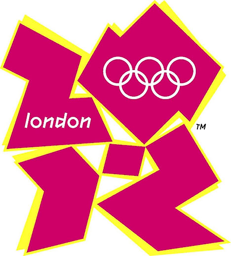
- The logo for the 2012 London Olympics, which was widely criticized as one of the poorest designs of the year, cost $625,00 to produce.
Typography Facts
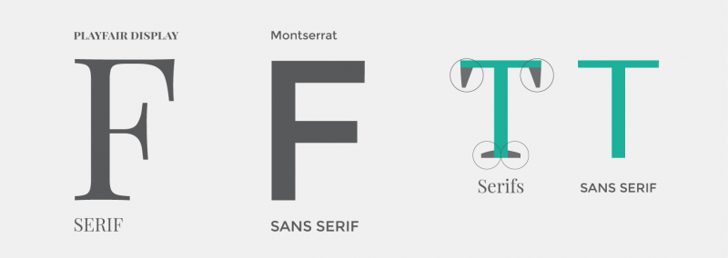
- Studies have shown that serif fonts (like Times New Roman) are generally easier to read in print, while sans-serif fonts (like Arial) are more legible on screens. This insight has influenced the choice of fonts in various media to enhance readability and user experience.
- Arial was created in 1982 by Monotype Typography as a substitute for Helvetica, a popular typeface at the time. IBM wanted to include Helvetica and Times New Roman in their first electronic laser printers, but they only had a deal with Monotype, so they needed an alternative to Helvetica.

- Comic Sans, designed by Vincent Connare in 1994 for Microsoft, is one of the most disliked fonts in the design community. Despite this, it was intended for informal documents and has been widely adopted in educational settings.
- The first typeface was created by Francesco Griffo in 1495 for use in a book printed by Aldus Manutius. The typeface was called Bembo and is still used today.

- Serif and sans-serif are the two main categories of typefaces. Serif typefaces have small lines at the end of each letter stroke, while sans-serif typefaces do not.
- Kerning is the process of adjusting the spacing between letters to improve legibility and visual appeal.
- In typography, the term “widow” refers to a single word or short line of text that appears at the top of a page or column, separated from the rest of the paragraph.
Bottom Line
We love ourselves some fun, along with our heavy-hitting content creation.
About Gallery Design Studio (GDS)
Content takes many forms—we make it visual first.
For over a decade, high-growth B2B tech brands have trusted us to distill complex solutions into clear, engaging visuals that their audience can instantly “get.”
Whether software, systems, or solutions, we help you communicate with clarity and impact—so you can focus on what’s next.
Learn more here.


